
Living in Color: The Swatch NEON State of Mind

Some people wear watches to measure time. Others wear them to set the tone. Swatch NEON is made for the second group. It brings back the bold color and graphic energy of the late ’80s and ’90s – not as nostalgia, but as a conscious choice. This is timekeeping for people who move with intention, who value clarity over convention, and who understand that good design should feel right before it looks right.
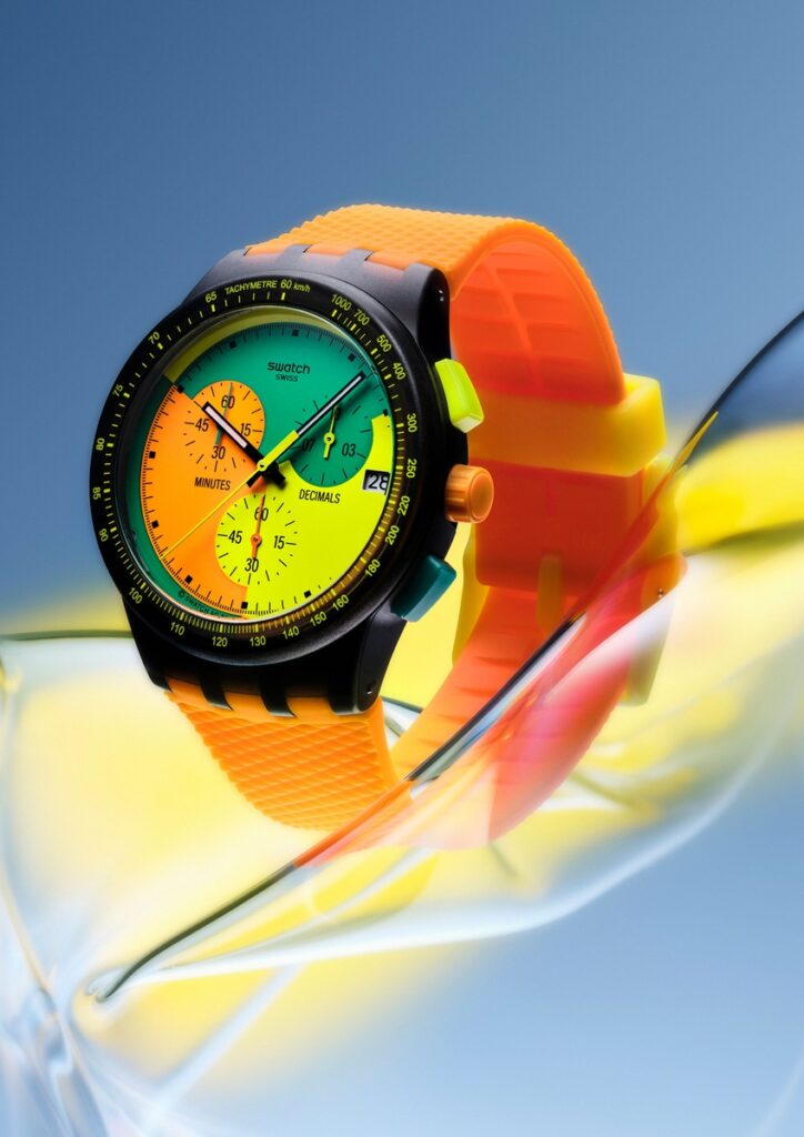
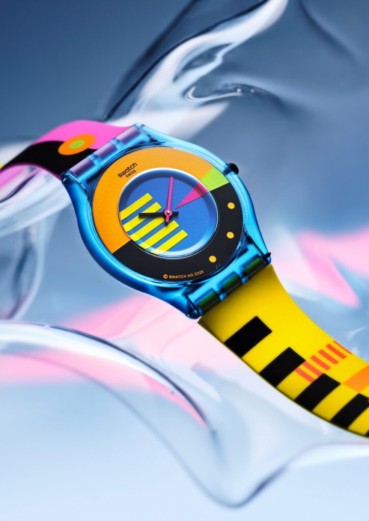
The NEON Collection revisits six iconic Swatch models and updates them for now. Slim cases sit easily on the wrist. Oversized dials feel confident, not heavy. Color is direct, bright, and unapologetic. Neon here isn’t decoration, it’s momentum.
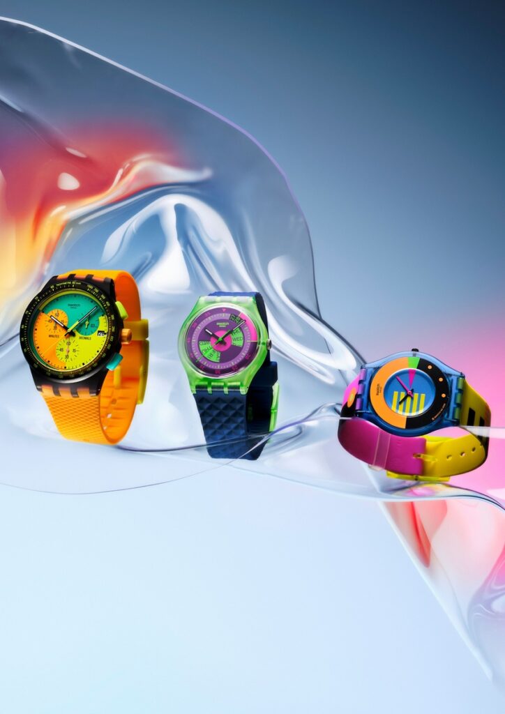
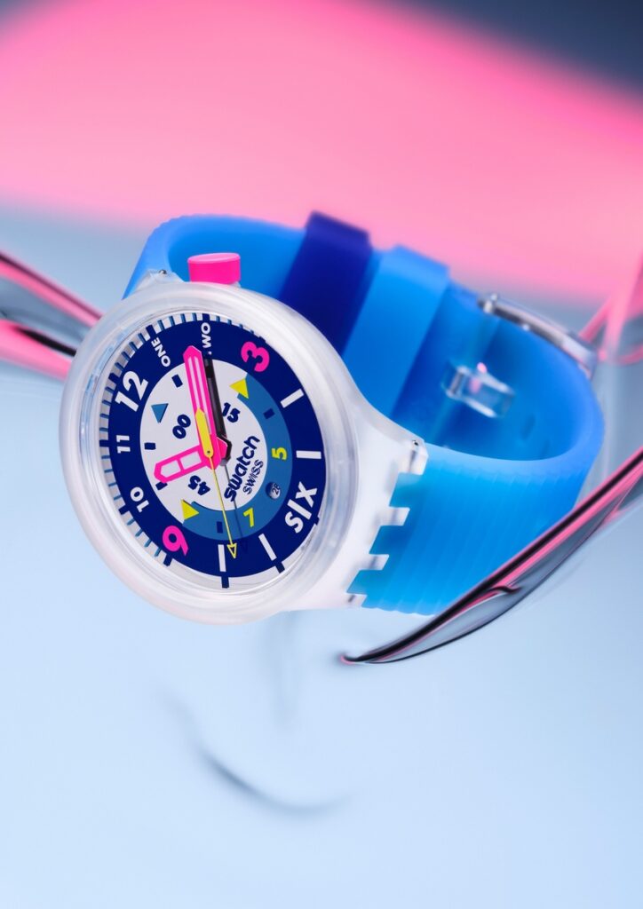
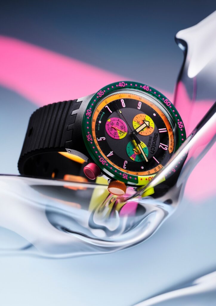
Each watch carries its own character. FLUMOTIONS returns in a super-thin profile, light and fast, like a memory that still feels current. SIGNAL FLAG pushes contrast and primary color to the foreground, graphic and precise. EMERALD CHRONO balances playfulness with function, while SKYCHART brings structure through its distinctive calendar window and electric palette. SEPPIA and HIELO go big and bold, designed for presence rather than subtlety.
What makes Swatch NEON feel relevant today is how naturally it fits into real life. Selected models feature SwatchPAY!, removing friction from daily movement. You tap, you go, you stay present. Luxury here is not excess, it’s ease.
This is design for people who travel light, both physically and mentally. A NEON watch works with linen in the heat of the city, denim on the move, or nothing planned at all. It doesn’t compete with style; it supports it. It doesn’t demand attention, it earns it.
Living well isn’t about playing it safe. It’s about choosing objects that reflect energy, optimism, and freedom. Swatch NEON is a reminder that time doesn’t have to be neutral. It can be bright, personal, and fully alive.


